
SA’s most effective online ticketing service.


Problem statement
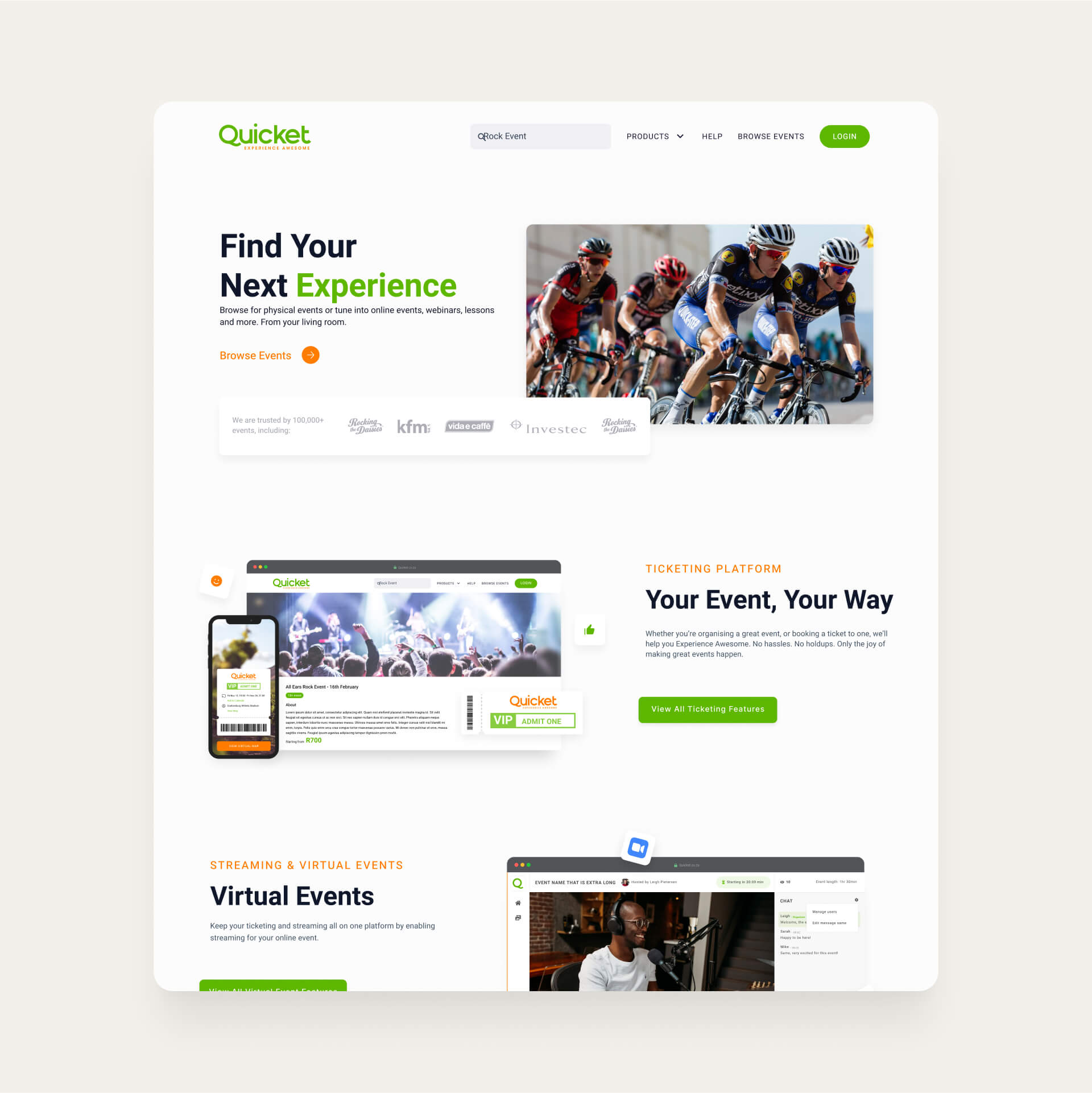
The Quicket landing page was initially designed to encourage customers to browse local events on the platform. However, the team noticed that most ticket buyers accessed event pages directly through links shared on social media, bypassing the main landing page. While ticket purchases remained steady, there was a noticeable gap in new event setups by organizers. This insight shifted the team’s focus towards making the landing page and event management tools more engaging and valuable for event organizers, addressing their unique needs and ultimately driving platform growth.
Project Process
Below is the 3 month process timeline the team followed in order to solve the problem and achieve the set of goals. The project was broken down into three phases. Phase 1 focussed on evaluating the system and understanding the problem. In phase 2 we used the data collected to inform our optimisation approach. Phase 3 focussed on roll-out of the design and getting the project ready for development.


Design Audit
The design audit for Quicket focussed around an observation of the current system in order to identify any previously unforseen gaps in the design language. We did this by focussing primarily on the visual elements but some user experience elements were included in the Audit. The goal was to provide feedback to the Quicket team in the form of quality assurance. Below are some examples of the findings from the Audit.
Iconography
Throughout the website various inconsistencies with the icon pack were identified. This included a theme clash (Outline, Filled, Colour, Styled).


Buttons
1.Inconsistent buttons (Flat, Outline & Hover)
2. Secondary state differs depending on where you are in the application.
3. Certain Call to Actions have icons, others do not.
4. In some instances the main Call to Action is a secondary button style.
5. Some buttons have a hover state.Limited use of secondary colour (orange).
Saturation
Overdose of the main colour. Secondary colour is hardly used. This results in a lack of contrast and makes in hard to for the user to define the most important call to action on a page.

Researching Competitors
The Quicket team had been keeping up to date with what their competitors were doing and had some direction as to what their product offering might be lacking. We honed in on two competitors ,Ticketspice and Ticketleap, and used these to identify areas where Quicket fell short. What was interesting was that Quicket had the same features, but the marketing message and the lack of displaying the features made it seem as though they did not have them.

Designs
Based on feedback from stakeholders and the development team, the team refined the design, incorporating any necessary changes and making sure that the design met all requirements and was feasible for development.


Scaling to mobile
I had the opportunity to work on transitioning the web-based designs to mobile. This involved taking a careful and thoughtful approach to ensure that the design would scale well to smaller screens and still provide a great user experience.The process involved several key steps, including evaluating the design for mobile compatibility, adjusting the layout to match the size of mobile screens, and making use of mobile-specific UI patterns such as hamburger menus and swipe gestures.

Development Handover
This design handover provides developers with a structured blueprint to ensure a seamless, high-quality build. Every element is meticulously labeled with dimensions and spacing, which allows for consistent layout and responsive design. Interaction states, such as error and hover, are clearly indicated to guide expected behaviours, while modular components like subscription cards and icons promote reusability and ease of implementation.

"Specno's insights and understanding of the project goal earned positive remarks from us. They provided guidance on every aspect of the business and ensured smooth collaboration with the internal team."

Designing for Every Step of the Event Journey
Explore the diverse pages that power the Quicket experience, from landing pages that attract organizers to dynamic tools for ticketing, fundraisers, and subscriptions. Each design prioritizes clarity and functionality, supporting event creators in every aspect of their journey—from planning to selling tickets, gathering donations, and creating sustainable revenue streams.


Explore My Case Studies
View case studies for funded startups and established global companies

